top of page

Brand Matrix
-
black circle: permanent location
red circle: shifting or impermanent location
open circle: expensive as measured by time to prep/cook
closed circle: expensive as measured by money

-
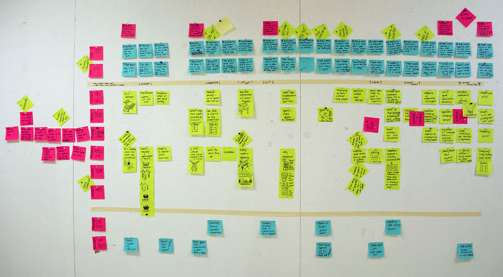
possible touchpoints of the service, I focused on developing the mobile pods (similar to food trucks) and takeaway recipe cards


-
value flow analysis: how the service would affect participants on a personal, household, neighborhood, and city level

-
user journey: an imagined user, James (see above persona), that is representative of the target audience
-
service blueprint: a holistic overview of services offered, with emphasis on three layers: the user, the front-stage, and the back-stage

Logo Iterations
-
The logo emerged from the concept that this mobile pod, basically an easily-constructed wooden box on wheels, would deliver fresh food to neighborhoods without access.
Mobile Pod Iterations
-
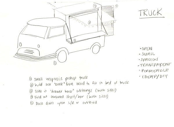
Design considerations included materiality, ease of use, affordability, and portability. The pod would be introduced as a kit-of- parts. Wood could be used to easily construct the the removable kiosk, which would be retrofit inside the bed of a pickup truck.

Mobile Pod Iterations
-
3D mockup of retrofitted pickup truck in Rhino

Mobile Pod Iterations
-
Not everyone building this kit-of-parts would have access to a pickup truck, so this version is a freestanding wheeled cart that could attach via trailer to any type of car and brought to location.

Mobile Pod Iterations
-
experimenting with visual systems, inspired by kitchen tiles, on the freestanding cart

Mobile Pod Iterations
-
a quick ergonomic study of how the layout of the pod would maximize the small space and facilitate easy use

Visual System Mockup
-
screen printing the wood mockup of the visual system that would be displayed on the walls of the mobile pod

Visual System Mockup
-
testing stamps of different fruits and vegetables

1 : 1 Testing Recipe Boxes
-
holds the recipe for tangy packed potatoes
box size: 6" x 10" x 8"
bottom of page